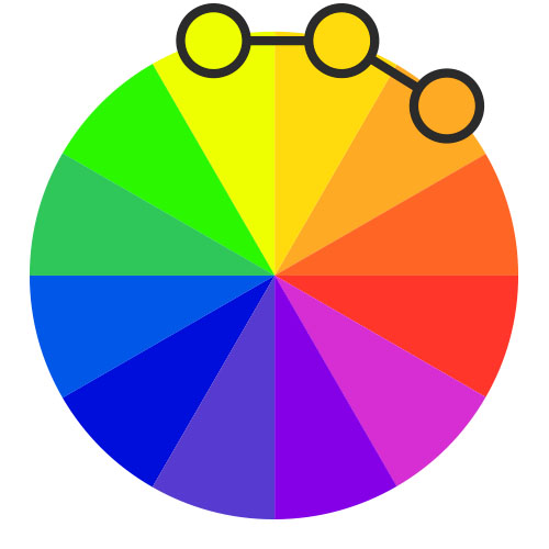
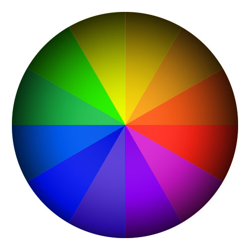
Colour wheel
There are six elements of art—one of which is color and it is always doing something. Sometimes color screams out a message, sometimes it casts a subliminal spell. First we want to talk shortly about color theory which creates a logical structure for color. A color circle, based on red, yellow and blue, is traditional in the field of art. Sir Isaac Newton developed the first circular diagram of colors in 1666. Since then, scientists and artists have studied and designed numerous variations of this concept. To understand color matching we must familiarize ourselves with the basic color wheel, shown below. You can generally reduce any strangely named color to the 12 basic ones in the color wheel. Colors like crimson, goldenrod and ultramarine are pretty much just red, yellow and blue.
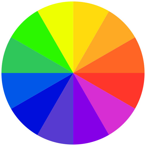
There are also definitions (or categories) of colors based on the color wheel. We begin with a 3-part color wheel.
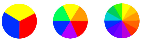
Primary Colors Secondary Colors Tertiary Colors
Primary Colors: Red, yellow and blue are the 3 pigment colors that cannot be mixed or formed by any combination of other colors.
Secondary Colors: Green, orange and purple are the colors formed by mixing the primary colors.
Tertiary Colors: Yellow-orange, red-orange, red-purple, blue-purple, blue-green & yellow-green are the colors formed by mixing a primary and a secondary color. That’s why the hue is a two word name, such as blue-green, red-violet, and yellow-orange.
Color Harmony
Color harmony refers to the property that certain aesthetically pleasing color combinations have. These combinations create pleasing contrasts and consonances that are said to be harmonious. These combinations can be of analogous colors, complementary colors, split-complementary colors, color triads, or monochromatic.
A color match based on analogue colors
Analogous colors are any three colors which are side by side on a 12-part color wheel. The colours have a unifying effect as they share the same colour family. This colour combination is rich and at the same time harmonious and smoothing. Usually one of the three colors predominates. Analogous color schemes are the next easiest to create. Traditionally, analogous color schemes all have the same chroma level, but by using tones, shades, and tints we can add interest to these schemes and adapt them to our needs for designing a nice dress.
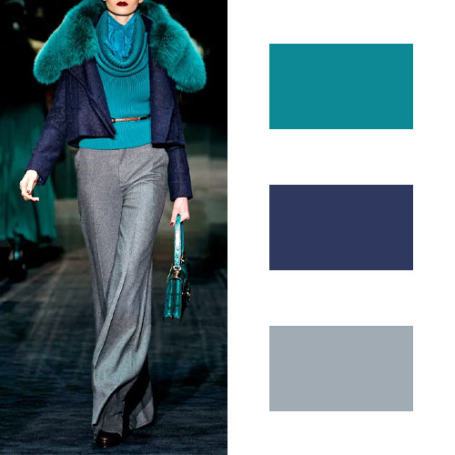
A color match based on complementary colors
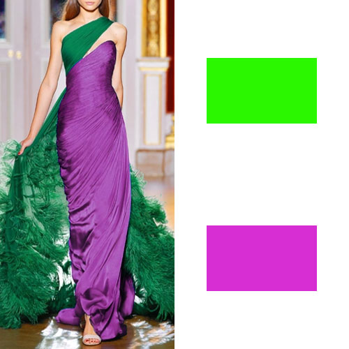
Complementary colors are any two colors which are directly opposite each other on the color wheel, such as red and green or by set color as red+purple and yellow+green. They are basically contrasting colours so will give you a striking high contrast effect. In the illustration above, there is a variation of green on the cape and a variation violet on the dress. These opposing colors create maximum contrast and maximum stability.
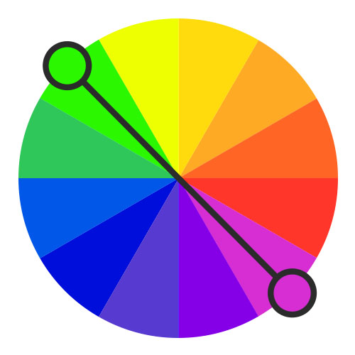
A color match based on complementary colors
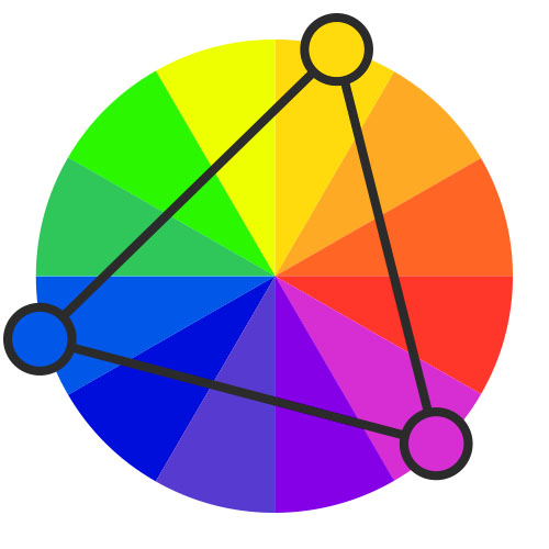
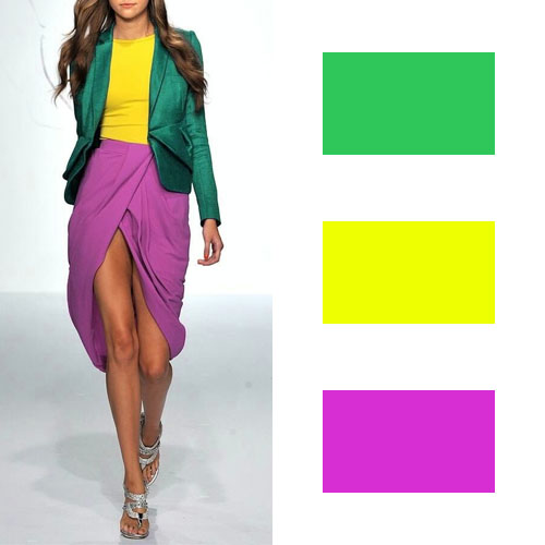
Triad colors are equidistant from one another on the color wheel. This is one of the more diverse color schemes. They can be difficult to do well, but add a lot of visual interest to a design when they are. You will get contrasting colours which are surprisingly harmonious.
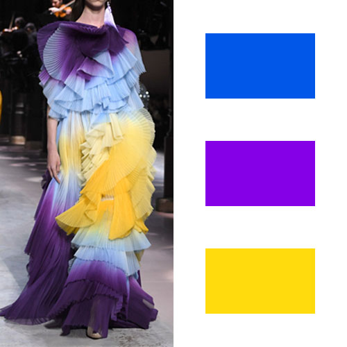
A color match based on split complementary colours
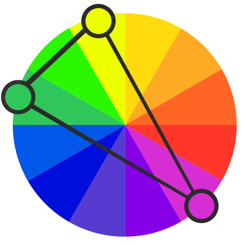
Split complementary schemes add more complexity than regular complementary schemes. In addition to the base color, it uses the two colors adjacent to its complement. This color scheme has the same strong visual contrast as the complementary color scheme, but has less tension. The split-complementary color scheme is often a good choice for beginners, because it is difficult to mess up.
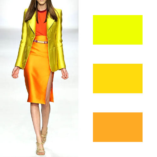
A color match based on monochromatic colours
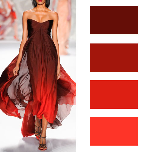
Monochromatic does not automatically mean grayscale or black and white. Monochromatic color schemes are made up of shades of just one base color. Simply said, from dark to light of one colour. For example in the illustration above, there is a shade of red going from dark shade maroon to light shade red. The result is a set of colours which are very easy on the eye. They have a unifying effect. Monochromatic schemes are easy to create, but can also be boring when done poorly. Adding in a strong neutral like white or black can help keep things interesting.
A color match based on pastel colours
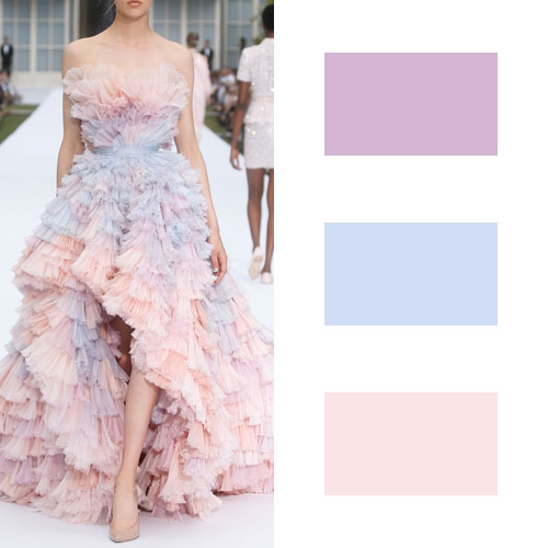

Here we are on our most loved color match. Pastel colors are colors that have enough white mixed into them to take away the saturation and turn them into a pale version of colors. The most popular pastel colors of the year have been millennial pink, light azure, creamy mint, and whimsy yellow. All these colors are the ones which are in trend now and everyone wants something in pastel. They are delicate and have a soothing calming effect so don’t be afraid to combine pastel shades.
A color match based on earth colours

Earth tone is a color scheme with multiple meanings. In its narrowest sense, it refers to “any color containing some brown” – the color of ground or soil. It can also refer to “natural colors” (colors found in nature) such as brown soil, green leaf, cloudy sky, as well as the red sun. These palettes can create a warm, nature-friendly atmosphere. It is a muted colour scheme and can look dull if not careful.
A color match based on earth colours
Cool colours are dominated by colours in the blue family. These colours are very soothing and very easy on the eye. Cool colours are white, grey, blue and green and its varying shades.You can add accent colours from the warm colour family to break the monotony of cool colours. These colors evoke a cool feeling because they remind us of things like water or grass.
No colour combination is right or wrong, whatever the colour theory and the media try to tell us. Whatever colour combination you choose for your clothes, accessories, it is a reflection of your personality. You can wear the colour of your choice with pride and celebrate life and its myriad colours.
Next steps
Learn more about Colors Name
Learn more about Understanding screen colors vs fabric colors